Welcome to 2024, Part 2. If you haven’t read part 1, start here. This is the second part of a two-part blog, where I share the top 10 charts that I think could tell part of the 2024 story, regardless of what’s to come. Today I present charts 5-1!
#5 Stock picking has been challenging lately
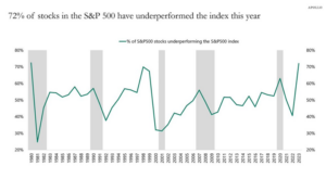
As many of you know, StrategicPoint prefers to use mutual funds and ETFs as part of our portfolio construction, and we tend to shy away from using individual stocks. This chart shows, which spans the last 40 plus years, what the percentage of stocks within the S&P 500 did vs. the index in terms of return for that calendar year. Another way to think about this is, would you have been better off just owning the S&P 500 index, instead of an individual stock within the S&P 500 for any given year, broken down by a percentage.
Last year was almost a record year, where 70% of the stocks in the S&P 500 didn’t have returns that beat the S&P itself! If you’re picking individual stocks, as this chart confirms, lately the odds have been stacked against you.
Why this might matter- The stock market had a good year in 2023, with the S&P 500 up over 20% for the year. However, as the chart above confirms, those good returns were driven by a fairly small subset of stocks and most of them were in the technology sector. If the stock market continues to go higher, the rest of the market would most likely need to join in. You can occasionally hear market commentators talk about the ‘breadth of the market’ and this is what they are referencing. For the 2022 bear market to really be over, we need to see more stocks in the S&P rallying and the breadth of the rally increase. This doesn’t mean tech stocks need to fall, but that the rest of the S&P 500 sectors start to play catch up.
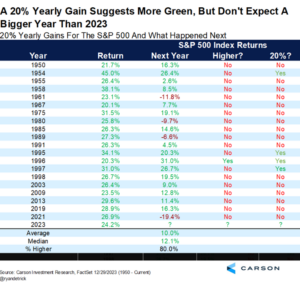
#4 When stock market returns were strong the previous year, as they were in 2023, does that lead to another great year for stocks?
Last year was a very strong year for the S&P and this chart shows that if history is a guide, that after a year in which the S&P 500 was up 20% or more, stocks tend to do well the following year as well. Although interestingly, the following year is not typically as strong as the previous year. This sort of makes logical sense when you think about it, that if stocks have a really good year return- wise, investors on average must feel optimistic about the future. Then the following year, unless something major changed the narrative, that optimism would, in theory, continue.
Why this might matter- This one is fairly obvious on why this might matter for 2024. In 2022 the stock market lost almost 20% as recession fears grew. As 2023 started, those recession fears were extremely high and many investors positioned their portfolios for a recession. As the year progressed, recession fears subsided and, in my opinion, many investors rebalanced their portfolios back into higher equity allocations, when their fears of a recession failed to materialize. If history is a guide, last year’s strong stock market returns should set 2024 up to be a fairly decent year for stock market returns as well.
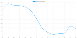
#3 The Yield curve is still inverted…for now
This is a yield curve for the US Treasury market, as of a few days ago, with the yield an investor will receive on the Y-axis, for the duration that they give their money to the government on the X-Axis. I’ve been sharing a chart similar to this in recent client meetings, because this is abnormal. Typically, one would expect to earn the lowest yield for the lowest duration of the bond. Here we see investors are earning more yield for shorter bonds than they earn for longer ones. There’s a myriad of reasons why this is, and Laura and I spoke about it on a recent podcast, but the point is this will not continue.
There’s really only two ways this curve can un-invert. The first is that the bond yields on the longer end could rise, a lot more than the 5% plus we currently see on the shorter bonds. So, think 6-7% for longer bonds, which would certainly make the curve move to a more traditional upward slope. The probabilities of this occurring do seem low to me, as inflation has come down a lot and there currently isn’t much of a reason to drive longer term rates that high (to say nothing about the impact that rates that high would have on the Federal Budget).
The more traditional way for the curve to un-invert would be for the shorter duration bond yields to fall. It’s no secret that the Federal Reserve sets interest rates, and those rates heavily influence only the front end of this curve. Investors in longer-term bonds are more concerned about economic growth expectations, inflation expectations and the direction of future rates.
I assume most readers by now have heard that expectations are for the Federal Reserve to start to cut rates in 2024. Inflation isn’t as bad, and higher rates can really slow the economy if they are kept higher than necessary for too long. Wall Street prognosticators can argue about when they will start to cut and how many cuts they will make in 2024, but that’s irrelevant for my point. If the Fed Reserve starts to cut rates that front end of the yield curve (which their rates heavily influence) will start to come down in lock step. If longer term rates don’t move, then as the Fed starts to cut, the curve will slowly start to return to its normal upward slope.
Why this might matter- For the first time since the pre-Great Financial crisis, many of us are enjoying making real income sitting on cash in our bank accounts. With a little work as a consumer, it’s not terribly difficult to find a bank that will pay 4% or more to park our cash with the bank. These currently high rates are a result of the inverted yield curve! If and when the Fed starts to cut rates, we will see the interest we make sitting in cash start to fall as well.
For a while in 2022 and even early 2023, other bank products like CD’s, really didn’t make much financial sense compared to just leaving our cash in a savings account or money market. If and when the Fed starts to cut rates, we may see where CD’s start to make more sense for excess savings.
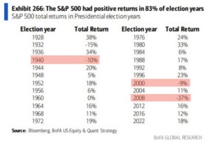
#2 It’s a Presidential election year, let’s look at how stocks have historically performed.
Well, that’s a pretty clear picture, isn’t it? Granted, the BofA team forgot to shade 1932 when stocks were also down, but stocks have finished up 20 of the last 24 election years. Looking back at the 4 years when stocks performed badly, we see some patterns. In 1932 the US economy was mired in the Great Depression. In 1940, Germany invaded France and the market tanked as a result. In 2008, the US Economy was in the throes of the worst economic collapse since the Great Depression. Lastly, in 2000, we saw the results of Bush vs Gore head to Supreme Court to finally settle the recount dispute.
Why it might matter- On average stocks go up 3 out of every 4 years, or 75% of the time. Clearly election years have a slightly stronger return profile, as the chart above shows that 83% of the time stocks finish higher. It sounds trite to say it, but IF we can avoid a recession, a major geopolitical event and a contested election, history says stocks should be higher by year-end.
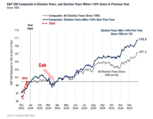
#1 Well if stocks are usually higher in an election year, what does it look like pre and post-election?
Allow me to explain what we’re looking at here before we get into the significance of this chart. This chart took the data from the S&P 500, from every election year since 1950 and pushed them all into “one year.”
So, this represents what all the election years combined did for every day of the calendar, and then laid it over the rest of 2024. On average, where was the S&P 500 on January 31st for example, then March 4th or whatever date you want to pick.
The point of this chart, and why I saved it for last, is that a clear trend starts to emerge for the path the stock market takes in election years. First is the “eek”, where we see, for whatever reason, stocks tend to dip into negative territory in late March or early April. I personally suspect some of that is folks selling stocks to cover the taxes they may owe, but regardless, weakness in those months would not be out of the historical norm. This is also a time period where there may be the most uncertainty around who will be the nominees for the upcoming Presidential election. As the summer progresses, stocks start to grind higher slowly. Again, my personal interpretation of this grind higher for stocks is predicated around the idea that the market starts to gain some confidence in who the two main candidates for the election will be. Then stocks tend to plateau from mid-August all the way to election night. During that August to November time period, the two candidates are engaging in debates and the race is heating up, which gives investors and Wall Street some pause about who may just win come election night. Finally, after the election is over the market clearly finishes strong to end the year.
Why this might matter- Mark Twain is credited for saying “History doesn’t repeat itself, but it often rhymes” and I think this chart is good road map for what may occur during 2024. There are a million and one things that could disrupt this road map obviously, and I believe most of them can be narrowed down to geopolitical events or economic events. If you told me that the US economy would slow in 2024 but avoid a recession AND that geopolitical events (Ukraine, Gaza, Red Sea, China & Taiwan relations) wouldn’t escalate beyond current levels, it wouldn’t be unreasonable in my mind to see the S&P 500 follow a similar path during 2024 to what is laid out in that chart.
Summary
I hope you’ve enjoyed this glimpse into some of the items that I believe could heavily influence the markets in 2024. As you can probably deduce, there’s a sense of cautious optimism in many of these charts, even if history doesn’t repeat and just rhymes. The bears get a lot of press in the financial media, because after all, fear sells, and in an election year there’s usually a heightened sense of fear as the election draws near. I have a feeling I’ll be revisiting some of these charts in client meetings and calls, as a gentle reminder that election years have historically been good years for stock market returns, regardless of who wins come November.
Derek Amey serves as Managing Partner and Co-CIO at StrategicPoint Investment Advisors in Providence and East Greenwich. You can e-mail him at damey@strategicpoint.com.
The information contained in this post is not intended as investment, tax or legal advice. StrategicPoint Investment Advisors assumes no responsibility for any action or inaction resulting from the contents herein. Derek’s opinions and comments expressed on this site are his own and may not accurately reflect those of the firm. Third party content does not reflect the view of the firm and is not reviewed for completeness or accuracy. It is provided for ease of reference.
Certain statements contained herein may be statements of future expectations and other forward-looking statements that are based on SPIA’s current views and assumptions and involve known and unknown risks and uncertainties that could cause actual results, performance or events to differ materially from those expressed or implied in such statements. In addition to statements which are forward-looking by reason of context, the words “may, will, should, expects, plans, intends, anticipates, believes, estimates, predicts, potential, or continue” and similar expressions identify forward-looking statements. Forward-looking statements necessarily involve risks and uncertainties, and undue reliance should not be placed on them. There can be no assurance that forward-looking statements will prove to be accurate, and actual results and future events could differ materially from those anticipated in such statements. SPIA assumes no obligation to update any forward-looking information contained herein.

