One of the constant comments from market participants and the talking heads on TV is that the investing community has no historical experience to draw from on how this epidemic will affect the US economy, the global economy and, by extension, investments. There’s no model to use as a reference point.
Sure, the Spanish Flu epidemic of 1918 theoretically could be used, and we’ve seen some people do just that, but we believe that’s a big mistake. Back then, the Federal Reserve was still in its infancy, the world was fighting WWI, saving for retirement wasn’t even a consideration (because the average life expectancy was barely 50 years) and the only people who owned stock were the “ultrawealthy”.
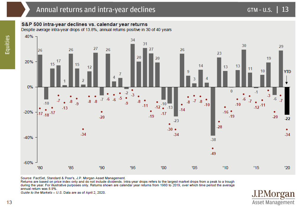
While the cause of this recession may be unique, the reaction in the stock market has not been unprecedented. In fact, so far, the selloff hasn’t been nearly as bad as 2008. The chart below (which is as of April 2, 2020) is from JP Morgan, and we love using this chart in client meetings.
The grey bars and the corresponding number next to the grey bars represent the calendar return of the S&P 500 for every year since 1980. For today, it’s the red dots that are far more interesting. The red dots represent the largest selloff at any point during the same calendar year. Look at this year and we can see the selloff reached a maximum pain point of -34% from the peak. That was a few weeks ago, before the recent market rally from the lows. Scan backwards throughout the years, and you will see a few more years where the S&P 500 has experienced a 34% loss, specifically in 1987 (Black Monday) and 2002 (DotCom Bubble). You can then see that in 2008, that the market sell-off reached a crescendo of -49%. So contrary to how many of us feel, so far the selloff hasn’t been out of the ordinary in terms of its magnitude.

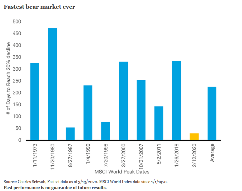
While the total decline in percentage terms may not be a record (yet?) the speed at which the market reached a bear market was, in fact, a record. As a reminder, a bear market is declared once the selloff reaches a 20% drop. The chart below from Schwab shows the total number of days that previous markets took to reach bear market territory. We can see that historically, the average time from peak to bear market has been around 200 days. Nothing about the last 6 weeks has been typical, and in fact this selloff smashed the old record from 1987 with days to spare.
The speed at which this occurred has been amazing, but in hindsight, not shocking. Typically, a bear market starts because the investor community starts to accept the reality of a recession. But the collective investing community doesn’t reach that consensus all at once- it’s usually a slow, drawn-out period, which explains the 200-day average between peak and bear markets.

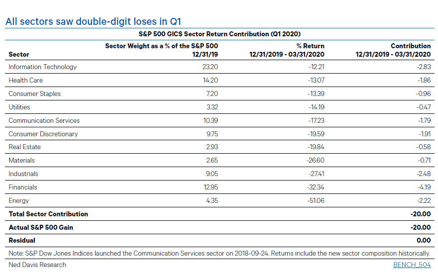
The selling was also extremely broad based. The chart below from Ned Davis Research shows that in the S&P 500, every sector experienced double-digit losses during Q1. There is an old Wall Street saying that certainly rings true right now which is “During a bear market, the only thing that goes up is correlation!”
The catalyst for the cause of this bear market, the speed at which it occurred, and the broad-based selling across every sector of the economy is the fact that the US is now in a recession. While it may be hard right now to see how the global economy, the US economy and Americans in general will ever return to “normal”, I am a firm believer in the human spirit. Never before has the entire world focused its efforts on beating a common enemy, and I’m not about to bet against our collective ability to beat this thing. Up for debate is what “normal” life will be like in the future. That answer will only come with the passage of time, and the solution to beating the virus.
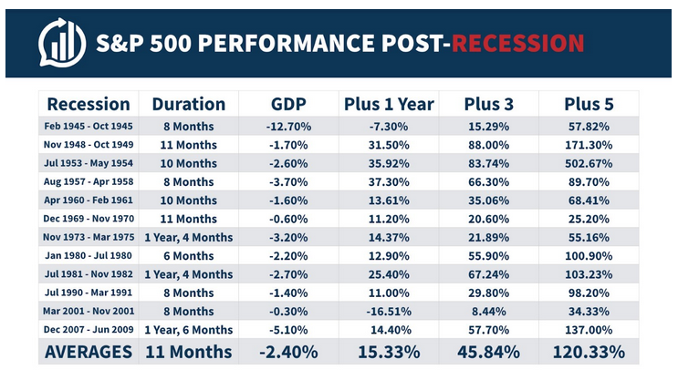
Let’s summarize some of the findings before trying to find a potential silver lining. The current bear market and the drop we’ve experienced in 2020 so far has not been out of historical norms. The speed at which it occurred was a record, and the depth of the selling left nowhere really for equity investors to hide. Everyone knows the US Economy is currently in a recession, but for the first time in modern history, the cause of the recession is unprecedented. With that said, how has the S&P 500 performed during previous recessions, and subsequently after? The chart below from Ben Carlson’s blog, shows the encouraging facts.
Source: A Wealth of Common Sense Blog-Ben Carlson
Here we see the dates of previous recessions in the US, the duration of the recession, and the total contraction in GDP. When we look one year out from the recession (the “Plus 1 Year” column) we can see that the recessions with the deepest GDP contractions (1945 and 2007) resulted in negative S&P returns one year later. In every other period, the S&P 500 was higher one year later. Move the goalpost out 3 or 5 years later, and not only are stocks higher in every instance, but the average gains are quite impressive.
No one has the ability to predict when and how this current global epidemic will end. Anyone speaking with conviction that they do know, is nothing short of a charlatan. Please be weary of those claiming to know. I’ve written before about how it’s hard to know what’s news, and what’s entertainment from the financial media. Please don’t lose sight of the fact that the media’s job is to make sure you keep watching, and fear sells. If you believe, like I do, that this isn’t the end of democracy nor the end of capitalism here in the US we will find a way through this and the recession will end at some point. If history is any guide, stocks will be poised for a strong rebound once that happens.
Derek Amey serves as Partner and Portfolio Manager at StrategicPoint Investment Advisors in Providence and East Greenwich. You can e-mail him at damey@strategicpoint.com.
The information contained in this post is not intended as investment, tax or legal advice. StrategicPoint Investment Advisors assumes no responsibility for any action or inaction resulting from the contents herein. Derek’s opinions and comments expressed on this site are his own and may not accurately reflect those of the firm. Third party content does not reflect the view of the firm and is not reviewed for completeness or accuracy. It is provided for ease of reference. Certain statements contained herein may be statements of future expectations and other forward-looking statements that are based on SPIA’s current views and assumptions and involve known and unknown risks and uncertainties that could cause actual results, performance or events to differ materially from those expressed or implied in such statements. In addition to statements which are forward-looking by reason of context, the words “may, will, should, expects, plans, intends, anticipates, believes, estimates, predicts, potential, or continue” and similar expressions identify forward-looking statements. Forward-looking statements necessarily involve risks and uncertainties, and undue reliance should not be placed on them. There can be no assurance that forward-looking statements will prove to be accurate, and actual results and future events could differ materially from those anticipated in such statements. SPIA assumes no obligation to update any forward-looking information contained herein.


